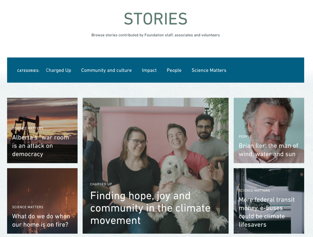
When designing your site and organizing your pages, it’s important to think about how a user might flow between the different screens/pages. Putting yourself in your users' shoes will help you design a more user-friendly site.
What is navigation?
It is the act of moving between screens of an app or website to complete a task. There are 3 main ways a user can move and how they do will be influenced by your information architecture.
Lateral navigation
It’s the movement between screens at the same level of hierarchy. For example, a user clicking on your top-bar menu to navigate to your top-level pages. Your primary navigation should provide access to all top-level pages. Examples of primary navigation include drawers and top-bar menus.

The hard part here is ensuring how the content is organized makes sense to the user including the top-level labels. Card sorting is one way to help get user feedback and quickly design good navigation.
Forward navigation
Forward navigation is the movement a user takes to complete a task. There are three types of forward navigation:
Downward in an app’s hierarchy to access deeper content for example from a list of blog of articles to read more about one article. The goal here is to present users with enough information to motivate and help them make a decision to move down information hierarchy.

Sequentially through an ordered sequence of screens like the steps a user needs to take to donate to your cause. Typically workflows like these are required to make certain business logic work but also they help reduce the friction a user experiences. It’s less intimidating to fill out a small form with multiple steps than one large form.
Directly from one screen to any other such as using a search box to find specific content.

Reverse navigation
Reverse navigation refers to the user moving backwards between screens. Users can move chronologically through their recent screen history or upwards through a site's hierarchy.
Chronological navigation refers to navigating in reverse order through a user’s history of recently viewed screens. For example, the Back button on a web browser is a form of reverse chronological navigation.
Upward navigation allows users to navigate one level upwards until the top-level screen is reached. For example, using breadcrumbs on your posts allows users to go up a category to view other posts in that category or all the way to the main list of blogs. It’s important to have this sort of navigation because some users will navigate directly to post. For example, from a Google search.

There you have it. When organizing your site, not only should you think about how certain information is grouped together but how is that information going to be accessed. Not everything needs to go on the main menu bar. It’s also not necessary to have all information on one page, it’s perfectly normal to have the user move down the site hierarchy if the information is not critical to the goal of the page.
