
One of the best things about the current state of the web is that things will run well and look good on both mobile and web. The bad thing: It can be hard to test across all the different number of devices.
So you’ve just recently redesigned your website and are looking to test it. The problem I’ve always run into when testing an application or website is that it’s hard to test on multiple devices. What most people will do is test on their computer browser and then maybe go to their phone and test it there.
The reality is that there is a lot of phones out there each with their own screen size and resolution. So although it looks good on one screen or device doesn’t necessarily mean it will look good on all others. So, what’s an easy way to test on multiple screen sizes from the comfort of your own computer?
Enter Chrome Dev Tools. I know it sounds a little scary, but don’t worry it’s not that hard to use. All you have to do is the following.
Open Chrome browser and navigate to the website you are trying to test.
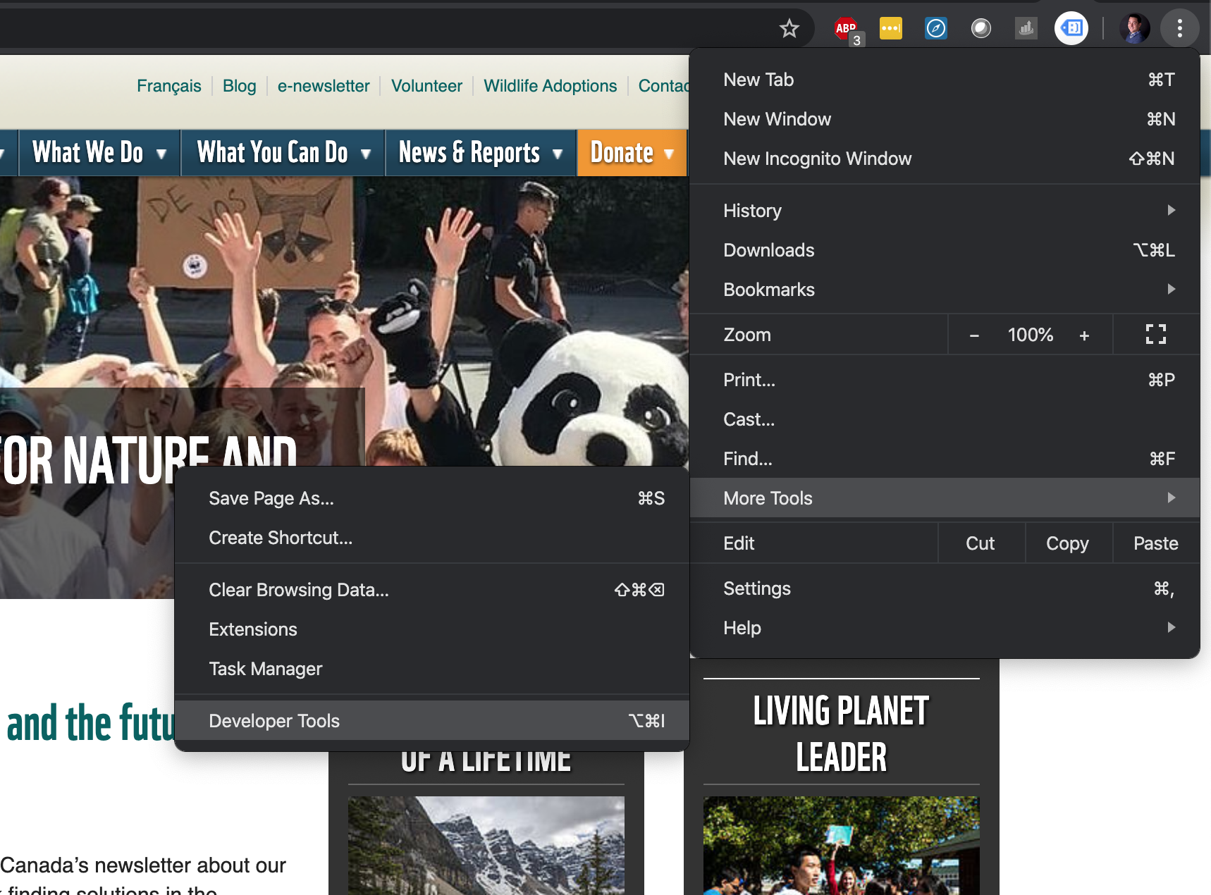
Go to options -> More Tools -> Developer Tools
It will open a little screen on top of your page. Click the device icon in the top left corner. This will toggle a device preview. If it doesn’t look right you can always refresh the page to make sure it loads properly as a device.

You can now select whatever device you would like or add custom ones. The size of the screen will change and your website will display however it is programmed to. Voila! Easy, fast testing!
